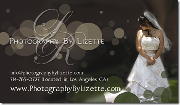
 I have been approached by a repeat customer to design her some business cards to match a new photography website she is having designed. Here is a screenshot of the site she is having built. She told me she wanted her business cards to have the same flair/feel to them…kinda classy modern with a bit of whimsy with the bubbles. Sophisticated and fun at the same time! As I was designing the cards I tried to ride the fine line…didn’t want them too stuffy yet couldn’t be too childish either…had to get just the right amount of bubbles and in just the right places and colors…lol. It wasn’t as easy as you would think! I actually had a difficult time and redid it several times before I was happy with the balance…but I will let you be the judge. I welcome your comments :)


2 comments:
i love your blog header!
Its the first time I have visited your blogs. Hope I can get some thing informative here.
Post a Comment